GSE Industrial Design: GSatSolar Part 3, Designing for Proper Use
Series Overview
This industrial design series is a great opportunity for us to show off the design processes we go through at GSE when we're creating new hardware products. This is part 3 of a six part series that points the spotlight at our new low-cost tracking terminal, the GSatSolar. If you have not read the other articles in this series, I suggest starting with the introduction piece by clicking here, because it has important information about our processes that will be referenced throughout this article.
Part 3: Designing for Proper Use
There are a number of subtle decisions about the GSatSolar that were made throughout the design process, and a few of those choices are part of a larger theme of design decisions related to making sure that the GSatSolar is an intuitive and easy-to-use unit. "Intuitive" is actually one of the six solution parameters we outlined in the POD process, and achieving an intuitive product while also making sure it installs and functions properly means designing the device to give the best change of proper mounting and use. Specifically, this means that the antenna inside the unit and the solar panel should be mounted and positioned in such a way that they are exposed to the sky.
The Design Process
We identified a number of ways to guarantee proper mounting and orientation, including some forced use and some visual cues. We wanted to make sure that users didn't need the instruction manual, and that meant the device itself needed to "tell" them, one way or another, how to use it properly. The majority of our decisions were related to the types of cues we would use, as well as the placement and aesthetics of those cues. How can we employ design decisions to guarantee proper orientation? If that fails, how would we want to have a visual cue to look, and where would we put it?
The Goal
The majority of proper use for the GSatSolar is making sure it is properly oriented when mounted on whatever it will be tracking. This means the "top" of the device should be clearly identifiable to users, and that it should be clear that the top should be facing up. This meant that the best control would be to design the device with asymmetric sides and functional elements so that it would be clear where the top was.
The Ideas
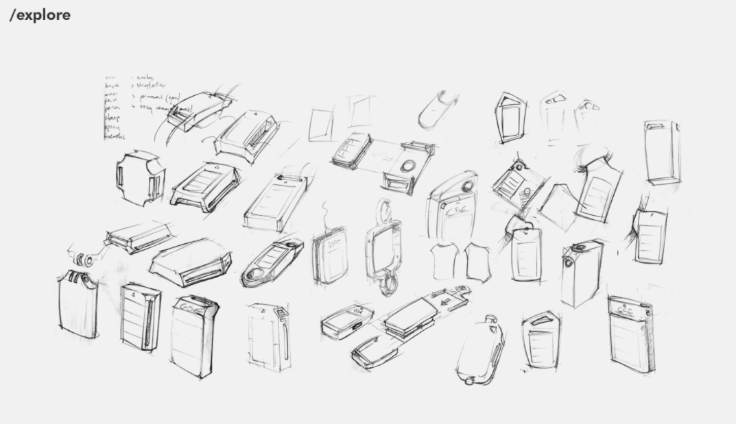
The start of the ideas list was pretty exceptional for this series of decisions. First, asymmetry was the most agreed upon hack for clarifying the proper device orientation, and ended up having multiple options on the table for execution. First, it was suggested that because the interior design places the antenna near the top of the device, we already have incentive to install the solar panel off-center, making a clear "top" portion of the unit. Next, the two strap bars could be different sizes, guaranteeing only one would be wide enough to accommodate the ear tag. Finally, even with a top established, maybe we should also include a visual cue that marked the top side(s) of the device.
Narrowing Down
The two asymmetrical designs seemed narrow and fleshed out enough to pass directly into the elimination/iteration stage. They were explicit in their functionality, and design options were closed by nature. This left us with the decision of whether and how to move on with the visual cue. Should we pass all 3 ideas toward a final design, or should we focus on one or two that would be sufficient? Ultimately, we decided to go with all three ideas and move them through the process.
Flesh Out
With the asymmetry pieces moving forward in a relatively closed design window, the visual cue would need to settle itself on a few different options. First, would the cue include text? If so, assuming it defaults to English, is that a good idea? Should we use iconography instead? If so, what is the best and most universal iconography? Finally, where would we put this visual cue? Should it be on the front of the unit with the logo and unit information, or on the back of the device, hidden out of the way?
Eliminate
The first and easiest elimination for us was the use of text, like "up," "sky," or "top." It was very obvious that iconography could work just as well, and that it would be better for the edge cases in which language muddles the interpretation. From there, our decision was whether to use sky imagery (sun/clouds) or antenna imagery (signals/tower/waves) with arrow(s). It was determined that because the GSatSolar logo included a sun element, that the best way to distinguish the message would be to put the universally recognized Wi-Fi signal icon with two arrows to indicate the direction in which it should be pointed.
Iterate
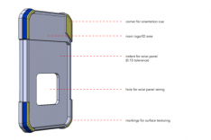
Carrying all three pieces into the iterate stage, the puzzle started to fit together more quickly and cohesively. Off-centering the solar panel left a natural gap at the top of the device where logo and unit information could be stamped, and opened the door for a hero corner, raised and enlarged, in the upper right corner of the device. This was the perfect location for a visual cue without taking away from the main stamping zone. These factors made it easier to determine that the upper strap bar gap would ideally be wider than the lower strap bar gap, so that when mounted on a cow, the tag would be more likely to hang in the proper orientation.
Finalize
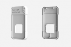
Once design decisions were settled, the details bore out to an incredibly functional and intuitive unit. The stamping zone left by the off-centered solar panel would be marked with the GSatSolar logo and unit information, which would be another cue for proper orientation because of the orientation of the letters and numbers. The hero corner gives us a reference point when writing about the device in instruction manuals or talking to customers, and also calls attention to the visual cue. The top strap bar gap is wider than the bottom strap bar gap by 2mm, making it impossible to put the ear tag mount through the wrong bar. Overall, it made the most sense to employ all three ideas in this particular design decision process, and the outcome is a much more intuitive GSatSolar unit.
The Outcome
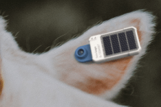
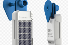
Asymmetry is the key to designing for functionality and intuitive use in the case of the GSatSolar. This tool gave us the ability to do so much with such a small device, and opened opportunities to flex our innovative strength in a subtle way. The strap on our ear tag mount is 20mm wide, meaning it will not allow a rancher to mount the unit upside down, because the top strap bar gap is 20mm and the bottom is 18mm.
Barring the success of design elements in guaranteeing the proper mounting of a GSatSolar unit, and considering the fact that we also designed this product for use in other markets where the ear tag mount won't be the mounting mechanism most commonly used, we felt the visual cue would leave little doubt as to the proper mounting, orientation, and use of the GSatSolar terminal. Of course, the terminal will work properly as long as the solar panel is facing the sun, but designing to orient the antenna upwards improves performance, and has potential to help with battery health.
The asymmetry of the strap bar gaps also provides opportunities for future engineering fur functional design, as it gives clip mounts and accessories the ability to include these orientation corrections by aligning with the size of each gap. GSE always considers the future with its design decisions, and that is why modularity is such a large piece of our design theory. We know that hardware devices should always be ready to be adapted and repurposed by the market, so whenever possible, we release hardware that has the most adaptive features and functionality that we can build into it.
More Information
As mentioned previously, there will be four more articles in this series that will bring you through our entire design process for the GSatSolar, with a focus on the major inflection points in the product's history. We encourage you to keep an eye on the blog and our social media as we bring you those articles. For more information about the GSatSolar, we invite you to read more about specs, features, and applications on the product's official website, and sign up for the newsletter as well.

