GSatTrack to PowerBI: Visualizing Data
Data Visualization: GSatTrack and PowerBI
In the Remote Data Ecosystems Series, we discussed the idea that data operations involve gathering, moving, transforming, and delivering. In the final article, we mentioned the multitudinous options available for delivering data, displaying data, and working with it in a UI. PowerBI is one of those many options, and whether you use GSatTrack's API to get your data into PowerBI or not, you can also use the GSatTrack portal to run reports and export data that can be visualized in PowerBI as well. Our own data scientists wanted to provide an example of that with a short walk through.
GSatTrack Offers Powerful Reports
GSatTrack stands as a cutting-edge, web-based solution that seamlessly integrates satellite and GSM tracking capabilities. Compatible with modern web browsers and operating on a multilingual platform, GSatTrack consolidates the positions of hundreds of products into a single unified interface. This innovative system empowers users to effortlessly display and manage asset locations and movements in real-time, offering insights into crucial data such as position, speed, altitude, and heading through continuous GPS updates. With GSatTrack, businesses gain access to a universal, hardware-agnostic, and cloud-based data visualization and management platform. This advanced solution enables managers to track, command, and control assets worldwide in near-real-time, fostering enhanced efficiency and decision-making.
Downloadable reports and data visualization play integral roles in the landscape of informed decision-making, presenting organizations with a multitude of benefits. These tools offer a profound comprehension of data, unveiling insights into patterns, trends, and anomalies that might otherwise go unnoticed. Rooted in evidence, reports and visualizations empower decision-makers to ground their choices in tangible data rather than intuition, thereby elevating the precision of decision-making. The ability to distill complex data into easily understandable formats is a hallmark of visualizations, fostering effective communication and consensus-building among stakeholders. By translating intricate information into accessible visuals, these tools become invaluable aids in shaping a shared understanding and facilitating more streamlined decision processes.
Downloading Reports
Reports provide Asset and Ecosystem Managers with powerful tools to visualize and export data in a more concise and actionable format than what Map Views and log lists can offer. These reports excel in synthesizing extensive data, transforming it into actionable insights that directly contribute to cost savings and efficiency measures. The flexibility of generating reports in both PDF and CSV formats enhances their usability, offering versatility in accessing and utilizing valuable information.
Types of Reports
Activity Report
Alert Summary Report
Asset Activation Report
Example: Fleet Trip Report
- Access the Report Menu
Log in to your GSatTrack account and navigate to the "Report" menu. -
Choose "Fleet Trip Report"
From the available report options, locate and select the "Fleet Trip Report" -
Select Specific Group(s) or Asset(s) and date
Choose the specific group(s) or asset(s) for which you want to generate the fuel consumption report. This helps in customizing the report based on your tracking needs.
Specify the date range for the report. This allows you to focus on fuel consumption data within a particular time frame, whether it's a specific week, month, or custom period. -
Run report
After selecting the specific parameters (group/asset, date range), click on the "Run Report" button. This will initiate the generation of the Fuel Consumption Report based on your specified criteria.
Interpreting and understanding the data in these reports.
Asset - The name of the asset whose report was generated
Trips - The Number of trips for the asset.
Uploading Data to Power BI
Power BI is a powerful business analytics tool developed by Microsoft that enables users to transform raw data into insightful and interactive visualizations. Leveraging a user-friendly interface, Power BI seamlessly connects to a variety of data sources, allowing for the creation of dynamic reports and dashboards. With its robust data modeling capabilities, users can explore and analyze data trends, generate meaningful insights, and make data-driven decisions. The platform supports a wide array of visualization types, from traditional charts and graphs to specialized geospatial maps. Furthermore, Power BI offers features like real-time dashboards, natural language queries, and seamless integration with other Microsoft tools, making it a versatile and indispensable tool for businesses seeking to harness the full potential of their data.
In our data, we have reports for Trucks "A101 ", "A102", "A103", "A104"
Speed report
Import GSatTrack Data
- Open Power BI Desktop.
- Click “Get Data,” and import your GSatTrack report.
- Select the Auto create report button.
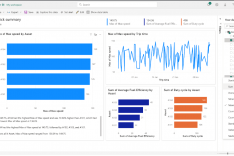
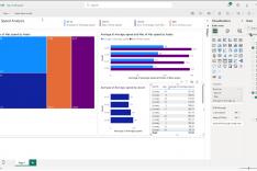
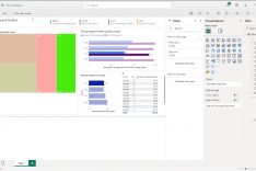
Upon successful data retrieval, proceed to create a new report in Power BI. For this iteration, focus on visualizing the speed per asset. Configure the assets in the 'Axis' field and speed in the 'Values' field. Leverage the advanced formatting options within Power BI to fine-tune the visual representation.
Tailored Visuals
Power BI offers a diverse range of visualization types, empowering users to present data in compelling and insightful ways. Common visualizations include bar charts, line charts, and scatter plots for exploring trends and relationships. Additionally, pie charts and donut charts are effective for illustrating proportions. Power BI's robust mapping capabilities enable the creation of informative geographic visualizations through maps and filled maps. For data distribution and variability, users can employ histograms and box plots. Furthermore, gages and cards are useful for displaying key performance indicators (KPIs) succinctly. With a rich palette of visualizations, Power BI allows users to tailor their reports to effectively communicate complex information to diverse audiences.
Select Visualization and Drag Measure
- Click on the visualization.
- In the "Visualizations" pane, drag the desired measure to the "Color" field.
Modify Color Scale or Use Conditional Formatting
- Click on the measure in the "Values" well.
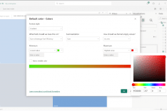
- In the formatting pane, either modify the color scale by selecting "Gradient" or enable "Conditional formatting" for a more granular control over the color gradient.
Updating the Titles
- Click on the visualization for which you want to update the title.
- In the "Visualizations" pane on the right, locate the "Title" field.
- Modify Title Text:
- In the "Title" field, click on the existing title text to edit it directly.
- Enter the desired title or make changes as needed.
Save the Power BI Desktop File
- After creating or modifying your report in Power BI, click on the "File" tab in the top left corner.
- Choose "Save" or "Save As" if you want to save a copy with a different name or in a different location.
- Select the location where you want to save the Power BI Desktop file and provide a name for the file.
- Click "Save."
Position Report
- Open Power BI and load your dataset.
- Navigate to the “Home” tab in Power BI and select “Transform Data” to open the Power Query Editor.
- In the Power Query Editor, assuming your data is in a single column, you can use the “Split Column” option to separate the latitude and longitude.
- Select the column containing the coordinates.
- Go to the “Transform” tab.
- Choose “Split Column” and then “By Delimiter.”
- In the “Split Column by Delimiter” dialog, since your coordinates are separated by a comma, choose “Comma” as the delimiter. Power BI will then split the column into two separate columns.
- Rename the columns to “Latitude” and “Longitude” for clarity.
- Click “Close & Apply” to apply the changes and return to the main Power BI window
Speed Heatmap
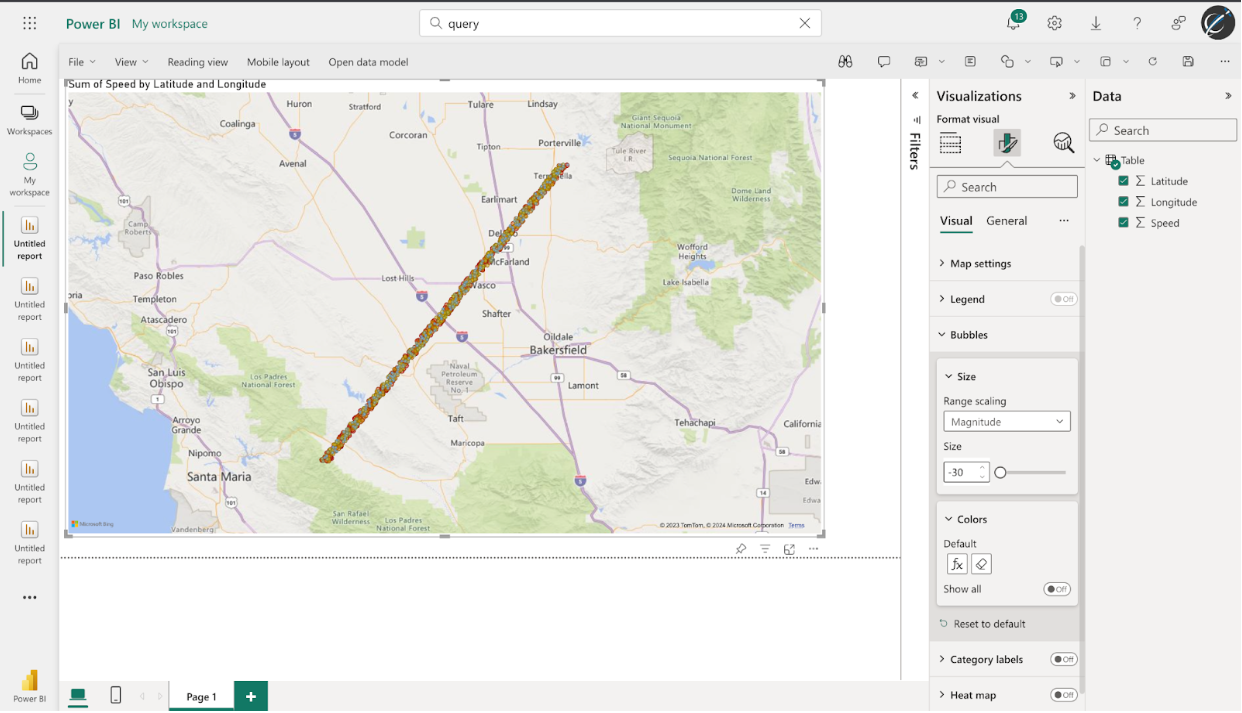
Creating Map Visualization
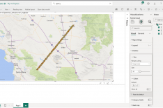
In the “Visualizations” pane, select the map icon to create a map visualization.
Drag the latitude and longitude fields data to the fields
Customize Map:
Customize the map by adjusting settings in the “Format” pane. we can change the map type, zoom level, etc.
Color by Max Speed
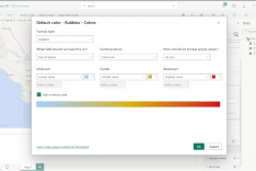
Drag the “Speed” field to the "Color " well in the “Visualizations” pane.
To customize the color scale, click on the “Color” icon and choose a gradient scale.

